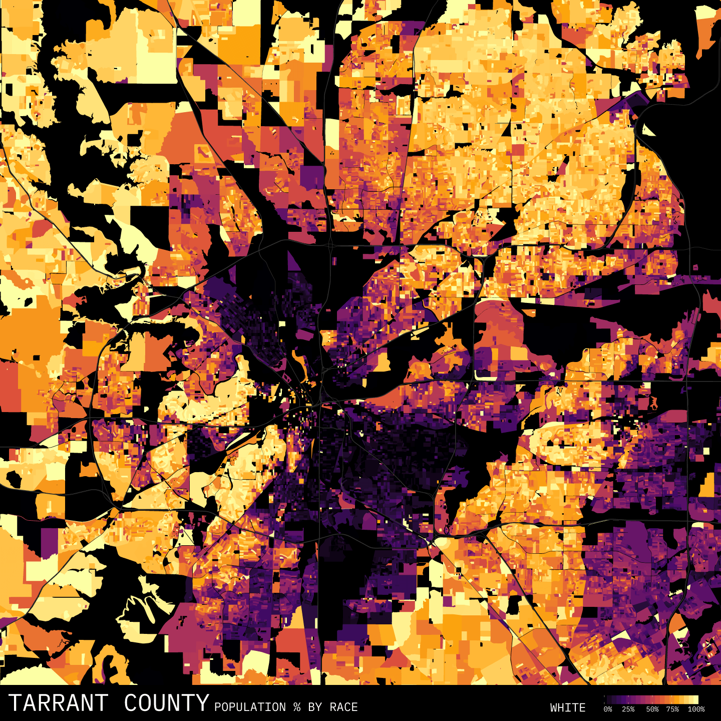
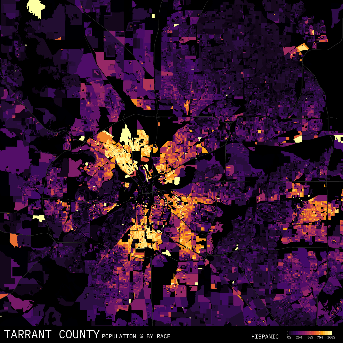
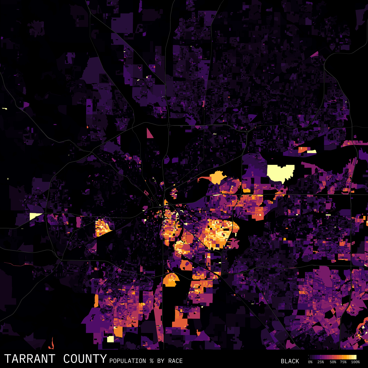
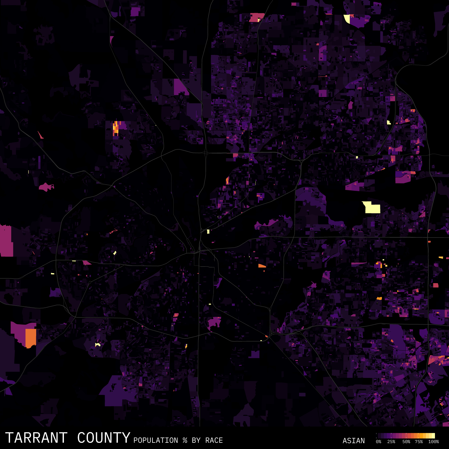
Continuing on my experimentation with the R language, I learned how to pull census data along with spatial data. This allowed me to plot a few rudimentary heatmaps showing the racial makeup of Tarrant county.
Ultimately, these maps are not the end goal. This was a proof of concept exercise for me. Now that I know that I can get the dataset pulled and plotted, I can move on to pairing that dataset with other datasets.